Wednesday, 18 December 2013

Editing Practice

Editing Practice

As a group we have practiced using iMovie to edit our pre-lim, which we found quite easy.  Although we have found out recently that finalcut editing software is much better to use because it has many more settings and gives a more professional outcome.  So before we use finalcut to edit our real film opening, I wanted to practice using it to get a feel for the software.  

 Once I had imported the first clip I realised that it was too dark so I went onto the side bar for colouring.  First I put up the exposure and then decreased the saturation lightly to create a darker tone for the horror genre.   I also wanted there to be no background noise so I went on the audio option and made background noise removal 100%.


I wanted to add some slightly sinister background noise to the clip so I went onto music and sound and eventually found an appropriate sound called Bass FX D3. .After editing the size of the clip using the blade tool the clip was an appropriate length, was visible and had effective sound. 


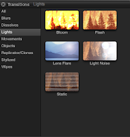
I then wanted to practice creating a flashback for our film opening.  So using the transitions side tab I picked the flash transition.  This looked effective as a conventional flashback.  I then layered some audio beneath it of a flash.  I also merged the two audios so the cut between them as not too harsh. 
I then imported the second clip and dragged it onto the timeline. Then using the blade tool I cut it down to the length I wanted it.  Next I experimented with multiple audios to find a "Cardboard box packing" sound which simulated normal movement in a home, then a gasp and boom when the camera went up to the ceiling.  After listening I saw this was not enough sound and so I layered another metal and glass crashing onto the clip.

                                                                              After importing and cutting down the last clip I added audio of a woman's heavy breathing to make the POV shot more realistic.  I also put in running footsteps audio to increase the realism. At this point I also put in walking footsteps into the first clip to match.  Then to end on a scary tone I put in thunder audio to give the shot an ominous feel.


To evaluate I think that the editing process went quite smoothly and I enjoyed experimenting with all the different audios.  I came across some technical problems because I am not very experienced in using finalcut but these problems will go in time.  One downfall of this practice is when I had saved and uploaded the video, the sound was not as loud as it was on the software.  I will have to look at this when we come to editing our final piece as not all the layers can be heard.

Monday, 16 December 2013

The Conjuring Opening Deconstruction


The sequence begins with the 'Warner Brothers Pictures' to the sound of non-diegetic string and woodwind instruments, that combine to make a creepy sound that links directly to the thriller and horror genre. The non-diegetic music continues as another clips from the production company 'New Line Cinema' plays.

The screen is black with the diegetic sound of talking, which continues throughout. The light clicks as an extreme close up of a dolls right eye can be seen, and the camera begins to zoom out until there is a straight cut to a mid shot of an interview taking place.

A straight cut to an extreme close up of the interviewers both in the frame with low key lighting as the interview scene now gives basic background information for the audience to establish what is happening as the camera begins to zoom out. There is an extreme close up of one of the characters before the camera then proceeds to zoom in on a picture of the doll.

There is then a straight cut to an extreme close up of one of the speakers, and as the line 'but then things got worse' is said, the non-diegetic sound of a quiet string instrument begins to play. A further straight cut leads to a flashback that contains classic horror conventions such as: low key lighting, letters in blood, a creepy doll, eerie music, a room destroyed (scribbling, cutting out of people in pictures etc) and shadows.

There is then quick straight cuts of damaged items with the sound of loud non-diegetic piano music which increases as the lights flicker and the sound of quiet clicking (like that of bones breaking) is heard which is disturbing for the audience, linking well to the horror genre.  A high angle shot of a character throwing the doll away allows the audience to wonder 'what will be the consequences' as the eerie music build up. There is the diegetic sound of the bin closing before the screen goes black.

Suddenly there is a thumping, as a faint light that allows the audience to see the girl in bed as she gasps at the realisation that the doll is making this noise. There is the diegetic sound of the door squeaking open and footsteps followed by the mid shot of the front door opening before a sudden straight cut to a close up shot of the dolls face before the camera begins to zoom out.

The camera cuts back to a close up of the girl's face and the on-screen diegetic talking between the interviewers and the other characters continues. As the lighting is again low key you can only see half of their face. The only light on the interviewer is backlight and there is an extreme close up of the male interviewers nose as he explains the situation. A straight cut to the eye and mouth of the female interviewer in low key lighting interrupts, before the camera pans back to the male talker.

The straight cut to a picture of the doll which is the subject of the debate, reminds the audience of the scary situation they are facing and this is distressing for the audience, linking back to the horror and thriller genre. Finally, there is a straight cut to the female interviewer and then back to the girls. As the interviewer says 'it wanted to get inside of you', the non-diegetic music begins to build due to what she said being disturbing and causing tension. The girl's look uncomfortable in a mid shot, which suddenly straight cuts to an extreme close up of the dolls face as the sequence ends.


House at the end of the street deconstruction


This scene contrasts with the rest of the film as it is light and bright. It is very summery and the choice of colour means that it liiks very happy.
There is lots of soft light used in this shot and the child is wearing white to show innocence again.
There is a teddy bear use here which convey's innocence and all the colours are pastels which are very soft and synonomous with children.
The colours are very light and warm which creates a very welcoming room. The netting in front of the windows could portray the idea of privacy being an issue.

The child's costume conforms to stereotypes as she is young as in s  long white nightie to show her innocence and purity. The nightie is still very clean which portrays the idea that she has not always worn it otherwise it would be dirtier. this contrasts with the image of her holding a knife as that is not something a young girl should have. When the audience see the knife they know that something is not right with the girl.


LIghting experimentation


Initially I went to the woods at 3pm as it would be getting dark enough to experiment with the lighting but still light enough for the camera to pick up the images. I had some problems because the weather was overcast which meant that it was a lot brighter and the clouds got in the way of the darkness.


 I then decided to wait until it was properly dark to do the photos as you would not see the effects of the lighting. I wanted to do a strobe effect bit we did not have the right torch which had the stone light setting on it. Instead I used a range of torches which had different  settings on them and used them at various angle for a wide range of effects. In this image I used a large led light which gave a wash of light without being too precise around the edges.


 This was the same torch but at a lower angle.

This torch could either be a very powerful spotlight or can do a good wide illumination but it does have very precise edges which could be a drawback.
 This torch is a lot less powerful than the others and so it only slightly lights up the area which could be good for our film as you can still see the shadows. It can also

This is when it is at it's smallest setting but still has murky edges which is good.

Sunday, 15 December 2013

Own Production Companies Task

The initial idea I had for our production company was to create something that involved the darkness and shadows, as these are two main conventions within the supernatural horror genre. I came up with the idea of a match being lit in the darkness to look something like this:


BlackoutProductions
After the production title has appeared, the audience will hear a quick blow sound, which will lead to the match being blown out, and the text disappearing as does the flame.

I filmed a match in front of the dark blanket on the chair. This is because if I had done it in complete darkness then the match would not be as clear to the audience, so I used a dark background instead. I dimmed the lighting in the kitchen slightly so the purpler of the blanket was not too vivid on camera.

I imported my video onto iMovie so it could be edited and manipulated into a production company sequence to be incorporated into our film opening. I felt that it should be clear, yet have some links to our supernatural horror genre.

After importing the video, I then split the clip to enable me to delete the parts that I did not want and allowed me to put them into any order I wanted, and then selected join clips to put them back as one long sequence again.

I chose the 'Fade to Black' transition as this was the most appropriate due to the content and the genre that I was trying to include elements of with the chosen visual and audio effects.

I then inserted the text that would have our production company name- 'Blackout Productions.' I chose for it to be in the top left-hand corner as it allows attention to be paid to the rest of the sequence. The font is in capital letters, and a professional font with perfectly formed letters. This subverts the genre I was trying to link to slightly as the typography within supernatural horror is traditionally sharp and classic gothic style.

I changed the font colour to grey so the text did not contrast too harshly against the dark background (it was originally white.) 

I used the website 'Free SFX' to allow me to have access to a wider range of sound and music effects. Although iMovie is good for basic editing, there is not a wide range of sound, and none of the already existing could serve the purpose that I needed it for. The effects were easy to download and saved directly to my iTunes. 

Next I layered the sounds so that the music continues as the blowing sound could be heard. I also edited the text to come in later so that the audiences focus was immediately drawn.

Finally, I shared the finished clip to Youtube as this would allow me to easily embed it onto the blog.


Here is the final clip.

I am pleased that:

  • I was able to create something professional looking and that included links to our chosen genre.
To improve:
  • I could have played around with lighting and setting more so that the smoke would have shown up more clearly.

Filming Preliminary

Practical-Filming Prelim 

Prior to our actual filming, we decided to try and do a test run of a few shots of the storyboard. When putting the clips together, i did a bit of editing using Final cu Pro, so that the clips flowed better, such as cutting as well as adding a small amount of special affects in order to make the clip suitable for a supernatural genre.


Title Practical

Title Practical

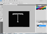
As most supernatural horror film titles which I researched had a type of serif font, I decided to try to subvert and mimic this when doing my own practical. I decided to use Adobe Photoshop to do this, as it has a range of different tool which could be used to create or manipulate my own font.

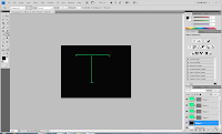
Firstly, using the line tool, I drew the outlines of what I wanted my letter 
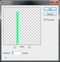
top look like, keeping in mind that I was going for a serif typeface. Then, I clicked the following to increase the thickness of the lines:

  • Filter
  • Other
  • Minimum
  • 5 pixels
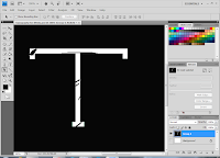
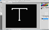
After doing this, I used the patch tool to draw a shape within the letter before filling it to fit the background so that it looked as though it has been scratched out, in order to subvert to the supernatural genre. Using the magic wand tool, I added another layer and decided to colour fill this with grey using the bucket tool.
As I felt that the typography needed to look more as though it had been tampered with, I decided to add more scratch-like points.


Background

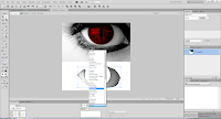
As we have been looking into our title appearing after the camera has zoomed into the eye of the antagonist, I wanted to present the title with this in mind using Adobe Fireworks.
Firstly, I found an image of an 'evil red eye' before using the Lasso tool to cut out the particular part of the image which I wanted to use. When I had finished doing this to all the areas which I wanted to use, I was left with several layers. 

Evaluation


As I wanted to subvert the common colour schemes used in supernatural horror, I kept the colour of the eye red however decided to fill the sclera in black to emphasize the supernatural element. Also, using a harsh light on a particular area of the eye, I was able to highlight the red area of the eye. which I think also enabled the eye to look effective. I also think that the typography was effective to some extent as the scratch like parts in the letter presented the supernatural elements which we are trying to bring across.

On the other hand, I think that this could have been more effective if there were more parts of the typography which emphasises supernatural horor. For example, if the colour had been off white, of if I had colour filled some areas to look like dirt marks. In terms of the background, I think it could have also been more effective if I had added a hidden image within the eye that may not have been easy to recongise, for example, a cross image, as this would fit in with our opening, as well as the theme of possession.