Title Practical
As most supernatural horror film titles which I researched had a type of serif font, I decided to try to subvert and mimic this when doing my own practical. I decided to use Adobe Photoshop to do this, as it has a range of different tool which could be used to create or manipulate my own font.
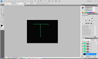
Firstly, using the line tool, I drew the outlines of what I wanted my letter
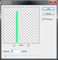
top look like, keeping in mind that I was going for a serif typeface. Then, I clicked the following to increase the thickness of the lines:
- Filter
- Other
- Minimum
- 5 pixels
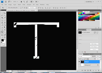
After doing this, I used the patch tool to draw a shape within the letter before filling it to fit the background so that it looked as though it has been scratched out, in order to subvert to the supernatural genre. Using the magic wand tool, I added another layer and decided to colour fill this with grey using the bucket tool.
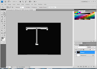
As I felt that the typography needed to look more as though it had been tampered with, I decided to add more scratch-like points.
Background

Firstly, I found an image of an 'evil red eye' before using the Lasso tool to cut out the particular part of the image which I wanted to use. When I had finished doing this to all the areas which I wanted to use, I was left with several layers.
Evaluation
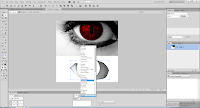
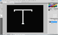
As I wanted to subvert the common colour schemes used in supernatural horror, I kept the colour of the eye red however decided to fill the sclera in black to emphasize the supernatural element. Also, using a harsh light on a particular area of the eye, I was able to highlight the red area of the eye. which I think also enabled the eye to look effective. I also think that the typography was effective to some extent as the scratch like parts in the letter presented the supernatural elements which we are trying to bring across.
On the other hand, I think that this could have been more effective if there were more parts of the typography which emphasises supernatural horor. For example, if the colour had been off white, of if I had colour filled some areas to look like dirt marks. In terms of the background, I think it could have also been more effective if I had added a hidden image within the eye that may not have been easy to recongise, for example, a cross image, as this would fit in with our opening, as well as the theme of possession.

 One of the most common symbols using in supernatural horror films where religion is a common theme, is the cross which is a direct link to Christianity. The cross is incorporated in The Devil Inside to appeal to the genre. Firstly, the symbol is red, which is symbolic to danger and violence as well as being a common colour scheme in this genre. In addition to this, the symbol is in reversal as well as being made to look as though it has been cut into the woman's mouth which all effectively emphasise the sinister element which is being brought across.


