Showing posts with label Evaluation questions 6. Show all posts

Sunday, 27 April 2014

Opening Title: Film Title

This was done on final cut pro, which is the software that we are using to create our actual film opening. 
I took the font that we were using for all of our other titles to make sure the opening title was in-keeping with the whole film opening.  
I manipulated the font to make it slightly blurred any more suitable to the supernatural horror genre. I then downloaded a font that allowed me to manipulate the font further, by changing the 't' in ritual to a cross symbol.
This links well to the supernatural horror genre of the film opening, making the title more interesting and effective.

Sunday, 16 March 2014

Title Sequence

Title Sequence 

In order to conform to the components of a film opening, our opening would have to include opening credits; the titles.  I have previously completed many blog posts on deconstructions of supernatural horror openings so I used this research as a starting point for our titles.  A particular film that I liked for their titles was Insidious.
 
As I wasn't sure what exact titles to put into the sequence I watched the Insidious opening again and took down all the vital credits they used to apply them to our opening.  

To add in a title on final cut I went onto the right side bar and selected the capital T to view the selection of titles. After going through all the examples I found a title which faded out slowly which reminded me of smoke.  This was very appropriate for the genre and our opening as we used candles to reflect the religious aspects of the film.  The smoke affect also created a mysterious and ominous atmosphere which I feel adds depth and interest to the credits.  
 After putting in the main production company name that we created, I then inserted the associated production companies.  The font I chose for the titles was optima as it had a slight gothic look about it because of the slimness and points of the letters.


To manipulate the text further I decided to change the colour of the text to make it more genre appropriate.  After using the colour wheel and trying different combinations I finally decided on black text with a hite glow because mixed together they made a light grey.  This colour fit in with the smoke effect and the dark atmosphere of the genre.

 This is a section of the timeline with the titles fitted above the footage.  It includes the production companies, members of the group with a main film role and the two actors we used.

In conclusion I feel that the title sequence is fitting with the genre of supernatural horror and our specific opening themes.  They look professional and interesting which are two qualities vital for the success of our opening.  One thing I would improve on is the timing of the titles in correlation with the changing of the shots to make it look effective and smooth.

Monday, 3 February 2014

Editing our opening scene


My task was to edit some of the footage that we had shot already for the final opening to our film. I choose to do the church scene. I imported the footage into final cut, and cut any talking between the media group and the actor, Rebecca's sister. Then I cut the footage so that each shot was not too long, I used the blade tool to do this. this made the sequence look more effective and professional as there wasn't any shot that was too long. 

To make the cuts between each clip of footage smoother I added a cross dissolve to make it not look like any jump cuts had been used and therefore less amateur.

After this I looked for sounds that were already on final cut to use to make the footage sound more like a horror film and conform to the conventions of a supernatural horror. I added the clips where they would be appropriate and layered lots of different sounds on top of each other. To make the sound flow better I used lots of short clips of sound and gradually decreased them in volume each time so that the change would not be as noticeable. 
Finally I added a visual effect to the footage to make sure that it was not as bright and made the main character look quite ill. 
 Overall I think the effect of the scene work very well. The sound work well together and the absence of speaking is not very noticeable. The sequence looks quite smooth and looks very professional. To improve could try to use our own sound effects that we have created. Unfortunately this footage did not save which meant that we had to re-edit it.


Sunday, 15 December 2013

Title Practical

Title Practical

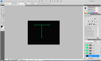
As most supernatural horror film titles which I researched had a type of serif font, I decided to try to subvert and mimic this when doing my own practical. I decided to use Adobe Photoshop to do this, as it has a range of different tool which could be used to create or manipulate my own font.

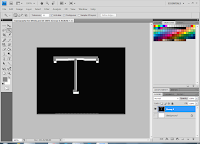
Firstly, using the line tool, I drew the outlines of what I wanted my letter 
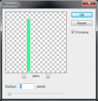
top look like, keeping in mind that I was going for a serif typeface. Then, I clicked the following to increase the thickness of the lines:

  • Filter
  • Other
  • Minimum
  • 5 pixels
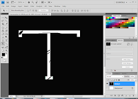
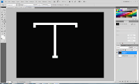
After doing this, I used the patch tool to draw a shape within the letter before filling it to fit the background so that it looked as though it has been scratched out, in order to subvert to the supernatural genre. Using the magic wand tool, I added another layer and decided to colour fill this with grey using the bucket tool.
As I felt that the typography needed to look more as though it had been tampered with, I decided to add more scratch-like points.


Background

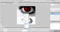
As we have been looking into our title appearing after the camera has zoomed into the eye of the antagonist, I wanted to present the title with this in mind using Adobe Fireworks.
Firstly, I found an image of an 'evil red eye' before using the Lasso tool to cut out the particular part of the image which I wanted to use. When I had finished doing this to all the areas which I wanted to use, I was left with several layers. 

Evaluation


As I wanted to subvert the common colour schemes used in supernatural horror, I kept the colour of the eye red however decided to fill the sclera in black to emphasize the supernatural element. Also, using a harsh light on a particular area of the eye, I was able to highlight the red area of the eye. which I think also enabled the eye to look effective. I also think that the typography was effective to some extent as the scratch like parts in the letter presented the supernatural elements which we are trying to bring across.

On the other hand, I think that this could have been more effective if there were more parts of the typography which emphasises supernatural horor. For example, if the colour had been off white, of if I had colour filled some areas to look like dirt marks. In terms of the background, I think it could have also been more effective if I had added a hidden image within the eye that may not have been easy to recongise, for example, a cross image, as this would fit in with our opening, as well as the theme of possession.


Wednesday, 4 December 2013

Insideous Opening Title Sequence Deconstruction


The clip begins on a black screen with the production company names slowly fading in and out.  The typography stays constant throughout the opening titles and is very conventional for a supernatural horror.

 The font is a bold, blood red but is also shadowy, as though a flickering light is being shone from the front.  The flickering in and out of the shadows is low lighting and seems like candle light which is commonly used to create a creepy atmosphere.  The lettering is in a gothic font with sharp flicks on the ends on the letters.  This, along with the colouring, reminds the audience of something demonic and dangerous.  The gothicness of the typography is made even more obvious by the slightly worn out look of the letters, the sections of black creates an even scarier
look for the film.


The title sequence continues with an off-white orb hanging on a balck screen.  This turns out to be a light on a ceiling but at this point it reminds the audience of the moon in the night sky.  A full moon symbolises witchcraft and are commonly used in supernatural horro to set the scene as creepy and mysterious.

The camera then spins around and transforms the orb into an everyday normal light.  This could be to symbolise how everyday mundane objects can be involved in some kind of supernatural elements.  The audience then see a young boy sleeping in his bed.  This boy conveys innocene as his bedcovers are childlike.  This creates a sharp contrast to the shadowy room and creepy low lighting.  The moonlight is coming in from the window and partially lighting the room.  The use of low lighting creates a creepy and sinister atmosphere.

A panning shot is then used to show the audience a seemingly normal family home at night time. The lowlighting and shadows play on the fear of the unknown so sets the audience on edge.  Eventually you reach a single lit candle.  As the camera zooms in you begin to see a partially lighted face.  Scary makeup and costume has created a monster doll type being light from below the face.  This a a huge convention in supernatural horror for the antagonist to be lit from below to cast creepy shadows over the face.            

After the Incidious title has gone, the remainder of the opening sequence is filled with transition shots of the family home.  The shots are edited to look like a charcoal drawing in black and white.  This increases the creepy and mysterious atmosphere around the house as the colours are very eerie.  The same typography is used throughtout which creates a harsh contrast between the plain white and black to the blood red.  The lettering disapears in puffs of green hued smoke which decreases the reality of the clip.  You cannot touch smoke so it goes with the idea of ghosts and how they cannot be physically caught.  The family photo also conveys a sense of normality.  But as familys are commonly used in horror films, the audience know they are not safe and the children are usually a target.

Non-diegetic sound is used throughout the opening sequence. High-pitched string instruments are usd in particular to build the tension and put the audience on edge.  It sounds almost like something screaming which is in parallel to the supernatural horror genre.  The sound all builds up to the Insideous main title which appears in correspondance with the loudest section of the music.  The basss line of the music builds up with the tension so the title makes the biggest impact it can possibly make. When the title appears the string instruments get even louder and more frantic. almost like an ants nest when disturbed.


Monday, 25 November 2013

Editing Task: Demonic Possession


I filmed my sister doing jerky, un-natural movements at the top of the stairs. The low camera angle gives her more dominance, which she would need being the demonic character as they have the most power. 


I filmed my sister on a Sony Handycam and then uploaded the video onto my iPhoto, this way I could then transfer it on to my iMovie for editing.

I imported my video from iPhoto onto iMovie. iMovie is a great programme to use as it gives a lot of different options such as sound effects and slow motion which you can customize to create the desired effect to suit the purpose of your video. 

I filmed my sister as one long video, which I did not realise would make cutting parts out a lot more tricky. To overcome this problem, I simply split the clip in the appropriate places, which then allowed me to cut out whatever actions I did not want.

Next I decided to speed up the video using fast forward (20x.) This made the actions look a lot faster and jerker, which ultimately made them look more un-natural and therefore more disturbing.

I then decided to customise the speed of  the 'fast forwarding'. Using 20x was too fast and made the clips stop or jump, greatly taking away from the desired effect.

I changed it to 200% which was slower, but worked a lot better as the sequence was of an un-natural speed still but flowed continuously instead of skipping or jumping like before. I selected the speed for each clip, and decided to slow the end right down, to give a much more frightening impact.

I then chose to rewind the clip, which made the actions play backwards, appearing much more un-natural than before, making my sister appear possessed which was very disturbing and would distress the audience.

I then stabilized any shaky video, as the camera was handheld because I did not have access to a tripod. This made the video quality much better and more professional. 

Finally, I added two different sounds effects for ultimate impact. I added a deep droning sound over the first few clips, and then added a thunder clap at the end. I made the sound at the start quieter and the thunder clap louder, which built up suspense and then made the audience (the people I have shown) jump. I added a 'fade to black' transition at the end, so the audience can use their imagination at the end, what did the possessed girl do next? 

Below is my final video. I am very pleased with the way it has turned out, especially after seeing the responses from people. It provides a frightening and disturbing impact, which was the ultimate purpose and links directly to the supernatural horror genre.


Sunday, 24 November 2013

Typography Practical

For this task I wanted to learn how to create my own style of typography before the group attempts to create the title for our film opening.  I found a website called Fontstruct, which allows you to put shapes together on a grid to create your own font. 


 After looking at the shapes I decided to create a more spiky, strong font as it would be easier to create and therefor look more effective.  To create a B I used two squares and four triangles to create a bold, sinister letter.


To create the Os, I experimented with many shapes until I reached some three quarter squares, which when put together created an edgy O shape.  The triangles on the corners also added a nice effect of danger.
I then found an effect which separated sides of the shapes.  I like this effect as I think that it gives more volume and dominance to the font which is in parallel to the supernatural horror genre.

I found this task quite difficult because the website was hard to use and required a lot of time and patience.  Although the end result was very effective and I will probably use it again.


 I also wanted to create a font by hand because I like the spooky, more rounded edge font.  Many supernatural horror films use the dripping blood effect for their typography so I used paint and water to create this effect.

 After using my hands to paint the "Boo" onto the newspaper, I added more water onto certain sections and lifted up the paper to make the red water drip, to create a blood effect.  I then put my hands into the red paint and made blooded hand prints on the writing.  Hands are often used in horror films so I thought that this would be very effective.
    I then wanted to try the same effect on a different background.  So I did the same process on a dirty brick wall which was a good effect for the supernatural horror genre.

I also liked this style of font creation because I found it easier as my skills are better suited to real life practical tasks.  The blood effect is also more spooky and maybe more suited to genre.